
This was the final text, with the second lines added to each character and the "S" modified so as to dip below the baseline of the word.
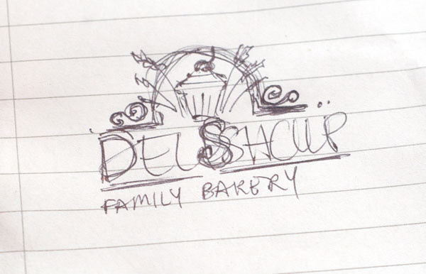
This was the original sketch done, giving a sense of what the final logo needed to look like.
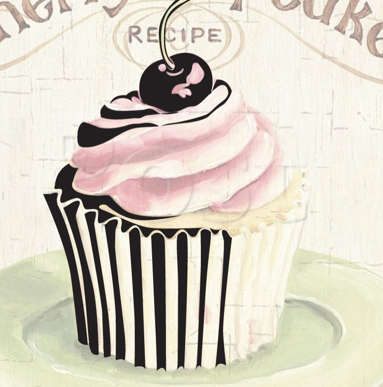
Here you can see the cupcake icon of the logo being detailed over an old-time cupcake illustration.
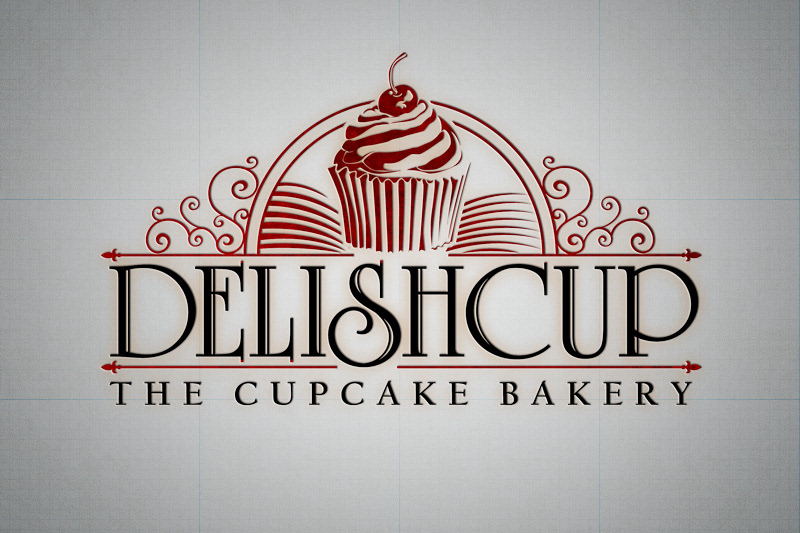
This is the final logo.