
Working with the owner/founder of 28 Page Agency, Jason Niedle, we put together an emblem to represent the agency. After initial brain storming on ideas, we settled on a sketch we were both happy with, which I then took and created a final design from. Jason then used this for a design presentation with a key client.
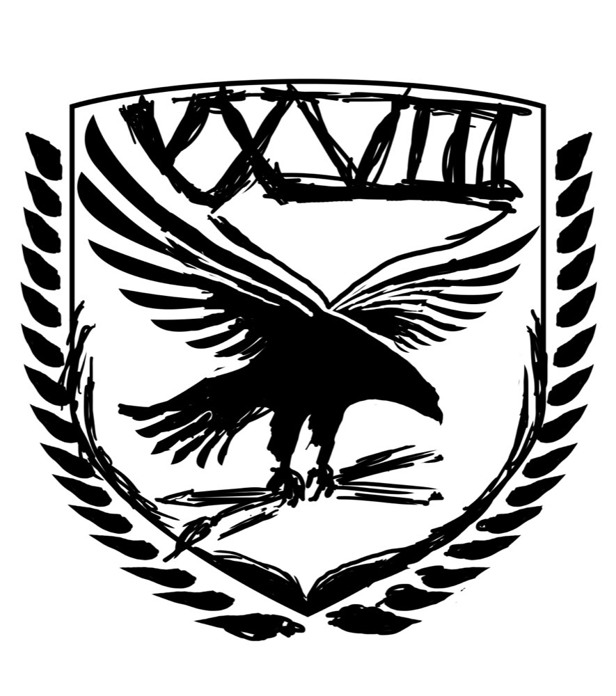
This was the final rough design, after many napkin sketches, brainstorming and looking at various elements and how they could best be combined.
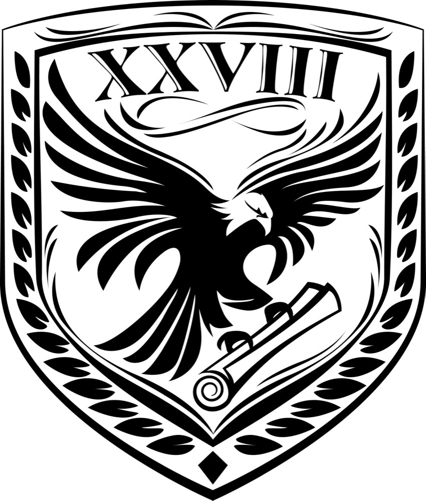
The final design remained quite close to the sketch except the change of the paint brushes to a scroll. As Jason is one of the leading interior book and layout designers, the scroll was a better representation of the 28 Page brand than the pen and paintbrush.
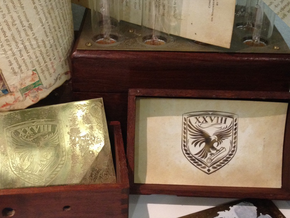
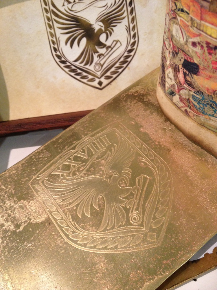
Here you can see a presentation put together by Jason which utilized the emblem in both printed form and as a metal etching.